Images are often the heaviest part of a web page, and they are frequently the largest element a visitor sees first. That makes them the best place to save time: an oversized photo can slow a page, push content around as it loads, and quietly cost you visitors.
The usual advice is to compress images without losing quality, and it is worth being precise about that phrase. Truly lossless compression exists and changes nothing. Lossy compression discards detail, but at sensible settings the loss is invisible to most viewers. This guide shows how to get the smallest files you can while staying on the right side of visible, using guidance from Google's web.dev, Mozilla, and the WebP project.
The short version: choose the right format, resize to the size you actually display, compress at a moderate setting, strip metadata you do not need, and load the result efficiently.
Why image size matters for speed and SEO
Google's Core Web Vitals include Largest Contentful Paint (LCP), which reports the render time of the largest image, text block, or video visible in the viewport. According to web.dev, a good LCP is 2.5 seconds or less, measured at the 75th percentile of page loads. Between 2.5 and 4 seconds needs improvement, and above 4 seconds is poor. Images are explicitly among the elements LCP measures, so a heavy hero image can decide whether a page passes.
Faster loading is not a guarantee of higher rankings, and page experience is only one of many signals. The more dependable benefit is that visitors see your content sooner, and that smaller images use less data on slow or metered connections, which matters regardless of any ranking system.
Lossless vs lossy: what without losing quality really means
Lossless compression stores the same pixels in fewer bytes, much like zipping a file: decoding returns exactly what you started with. PNG is lossless. Lossy compression removes detail the eye is least likely to notice. JPEG is lossy by design, and WebP and AVIF can work either way.
Mozilla's image-format guide gives a useful rule. For screenshots, diagrams, logos, and line art, prefer lossless encoding, because blurring and colored fringes around text and sharp edges are very visible. Photographs and other continuous-tone images can usually tolerate lossy compression, because the discarded detail is harder to see.
web.dev adds that JPEG quality is set on a scale from 0 to 100 and that differences across most of that scale are imperceptible to the human eye. In practice there is a wide range of settings where file size drops sharply and the image still looks the same.
JPEG vs PNG vs WebP vs AVIF: a quick comparison
Before choosing, it helps to know what each format is for. The summaries below follow Mozilla's image-format guide.
- JPEG: lossy, with no transparency, supported everywhere, and the most widely used format for photographs. Mozilla suggests preferring PNG when more precise reproduction is required, or WebP or AVIF when you want both better reproduction and higher compression.
- PNG: lossless with full transparency, preferred over JPEG when precise reproduction or transparency is needed. Files for photographs can be large.
- WebP: lossy or lossless, with transparency and animation. Mozilla calls it an excellent choice for images and animated images, with much better compression than PNG or JPEG.
- AVIF: lossy or lossless, with transparency and animation, and royalty free. Mozilla lists support from Chrome 85, Edge 121, Firefox 93, and Safari 16.1 onward, and advises including fallbacks with the picture element.
- SVG: a vector format, ideal for icons, diagrams, and interface elements that must be drawn accurately at different sizes.
- GIF: still works for simple images, but Mozilla suggests PNG for still images and WebP, AVIF, or APNG for animation sequences.
Step 1: Choose the right format
Mozilla recommends preferring WebP or AVIF for raster images because they generally compress better than PNG, JPEG, and GIF. Google's WebP project reports that lossless WebP images are 26% smaller than PNGs and that lossy WebP images are 25 to 34% smaller than comparable JPEGs at an equivalent SSIM quality index. Those are Google's figures for its own test images, so your savings will vary, but the direction is consistent.
AVIF can compress even better, though Mozilla notes it is somewhat less widely supported than WebP and does not support progressive rendering. For safety, offer a fallback with the picture element: list the modern format first and a JPEG or PNG last, and the browser uses the first format it supports.
- Photographs: WebP or AVIF where supported, otherwise JPEG.
- Screenshots, flat-color logos, and text-heavy graphics: PNG or lossless WebP, or SVG if the artwork is vector.
- Icons, diagrams, and illustrations that must stay sharp at any size: SVG.
- Animations: animated WebP or AVIF, or video, rather than GIF.
Step 2: Resize before you compress
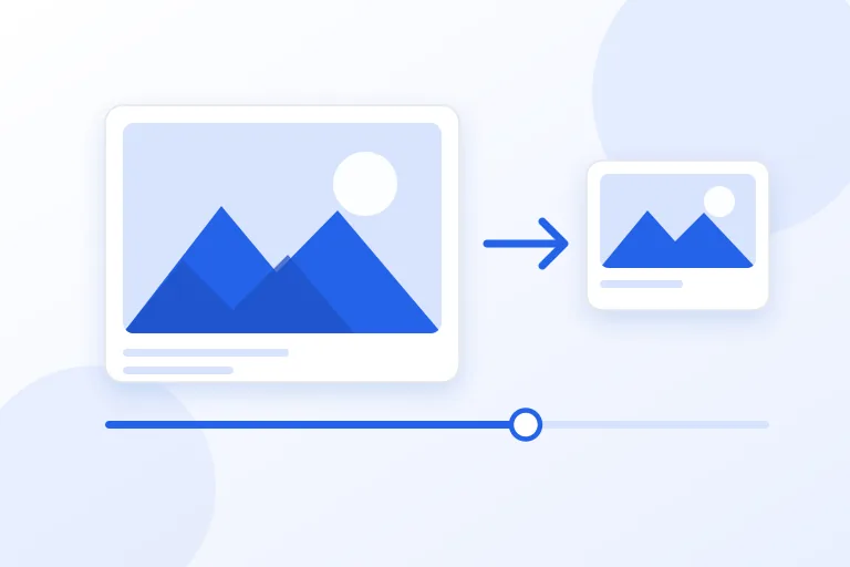
The biggest saving is often not compression at all but dimensions. A photo that is 4,000 pixels wide, displayed in an 800-pixel column, wastes most of its pixels. Resize the image to the largest size it will actually appear, then compress that.
Allow for high-density screens: if an image displays 800 CSS pixels wide, a version about 1,600 pixels wide covers 2x displays. Rather than shipping one large file to everyone, provide several widths and let the browser choose using the srcset and sizes attributes. web.dev's Learn Images course covers responsive images in depth, including these attributes and the picture element.
Step 3: Choose a sensible quality setting
For lossy formats there is no universal perfect number. Many people start photographs somewhere in the 75 to 85 range for JPEG and WebP, compare the result with the original, and step lower until a difference becomes visible. That range is a starting point from common practice, not a rule from any specification.
web.dev's advice for JPEG is pragmatic: it is almost always a safe bet to nudge compression a little lower than you think might be noticeable, especially when the image will be displayed small. Judge by eye at the size visitors will actually see, not zoomed in to 400 percent.
Progressive JPEG is also worth enabling. web.dev notes that it can feel faster to users and that encoding an image as a progressive JPEG almost always produces a smaller file than a baseline JPEG.
- View the original and the compressed version side by side at real display size.
- Check smooth gradients such as sky and skin, fine text, and sharp edges, where artifacts show first.
- Stop at the lowest quality where you cannot tell the difference, then reuse that setting for similar images.
Step 4: Strip metadata you do not need
Photos can carry camera settings, timestamps, and even GPS coordinates in embedded metadata. For web publishing you rarely need any of it. Removing it trims bytes and, more importantly, avoids publishing a location you did not intend to share.
Most image tools offer a strip metadata option. Check that it is switched on, and check what your tool keeps, such as embedded color profiles, which can matter for color accuracy.
Step 5: Load images efficiently
Compression gets the file small. Loading it well makes the page feel fast. These habits come straight from web.dev's guidance on lazy loading and layout shift.
- Set width and height attributes on every image. web.dev explains that omitting them increases an image's impact on Cumulative Layout Shift, because the browser cannot reserve space before the image arrives.
- Use loading="lazy" for images below the fold. It defers loading until the browser expects the image to be needed, based on its distance from the viewport.
- Never lazy-load the main image at the top of the page. web.dev specifically advises against lazy-loading images likely to be in the viewport at load, especially LCP images, because that delays the very element LCP measures.
- Give every meaningful image a descriptive alt attribute for accessibility and image search.
Automate it so the savings last
Once you have a workflow that works, automate it. web.dev's Learn Images course devotes whole modules to automating compression and encoding, to handling images in site generators, frameworks, and content management systems, and to image CDNs that transform images on demand. Automation matters because manual optimization decays: the next person to upload a photo forgets a step, and the page slows down again.
Whatever you automate, keep your original files somewhere safe. A good pipeline always reads from the originals and writes new files, so you can change settings later without compounding quality loss.
Common image compression mistakes
Most wasted bytes and visible damage trace back to the same few errors. Avoiding them gets you most of the benefit without any special tools.
- Compressing an already compressed JPEG again and again, which adds artifacts each time. Always compress from the original.
- Using PNG for photographs, which produces very large files.
- Using heavy lossy settings on screenshots and logos, which blurs text and edges.
- Uploading a full-resolution camera original and letting the browser shrink it.
- Using one quality number for every image, even though detailed and flat images compress differently.
A note on privacy when compressing images
Compression tools range from desktop software to websites. Many websites upload your image to a server, which matters if the photo shows people, documents, or places you would rather not share. A browser-based compressor works on your device, so the file does not need to leave it. If you are unsure how a tool behaves, test it with a throwaway image and watch the Network tab in your browser's developer tools.
Practical checklist
- Pick the format by content: WebP, AVIF, or JPEG for photos; PNG, lossless WebP, or SVG for graphics.
- Resize to the displayed size, plus 2x for sharp high-density screens, before compressing.
- Start photos at a moderate quality and lower it until a difference becomes visible.
- Always compress from the original file, never from a previous compressed copy.
- Strip metadata you do not need, especially location data.
- Set width and height on every image.
- Lazy-load below-the-fold images, but never the main image at the top of the page.
- Re-test page speed after making changes.
Research and references
This guide was prepared from the authoritative references below.